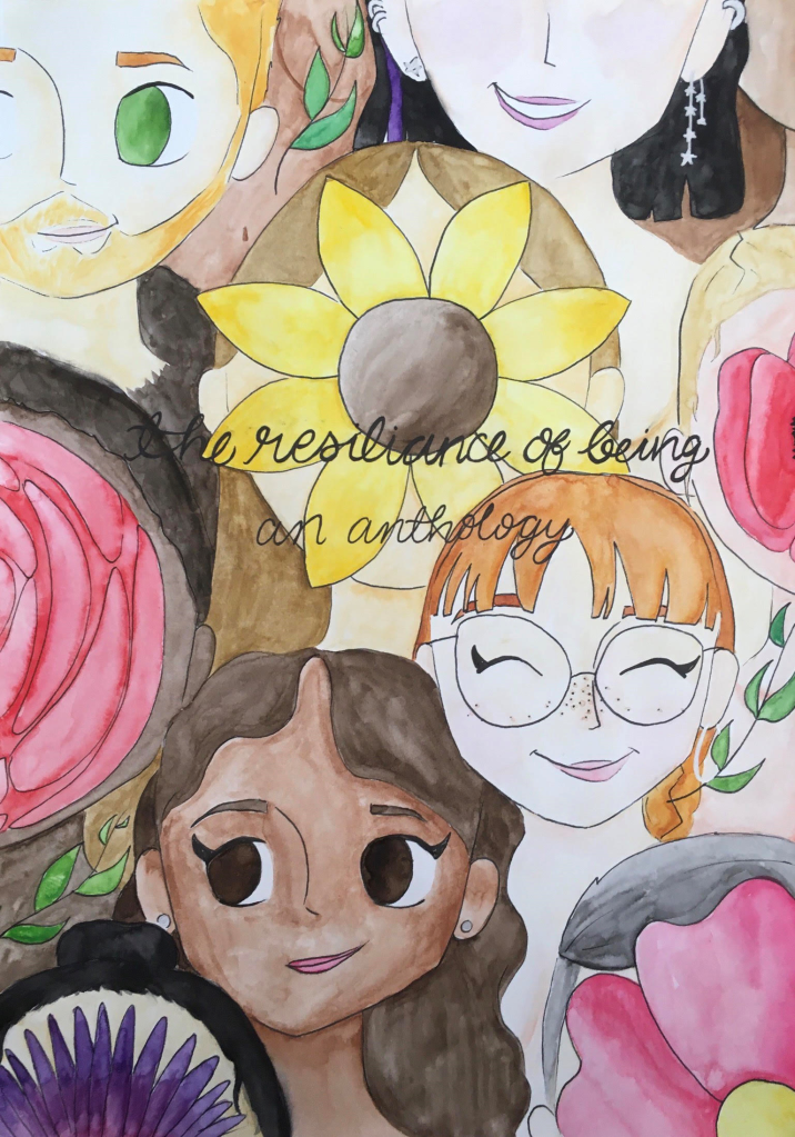
To try and find the perfect cover, we organised a front cover competition for artists, inviting them to submit a piece that embodied body neutrality and self-love. It was great to see artists take this prompt and interpret it in their own style, and we thought it only best to share this here too.
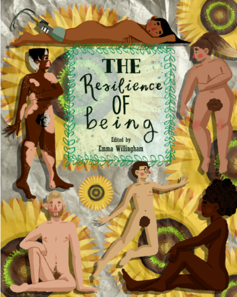
First up, we have our winner of the competition; Jacob Walden, a 16 year old student in the West Midlands. Jacob has always loved art and illustration, and feeling very strongly about the message told in this anthology, knew he wanted to submit to the competition. You can find Jacob’s work on Instagram @jacob.ben13. You can get a better look at the piece on the cover of the print book here.
We are also able to share a few of the submissions from some of our fine runners up, who have kindly allowed me to share their contributions.
Below, we have two impressive pieces from Klaire Doyle, an interdisciplinary artist based in the North of England. You can find out more about Klaire on her website www.klairedoyle.com or on Instagram @klairedoyleart
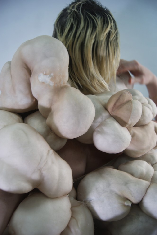
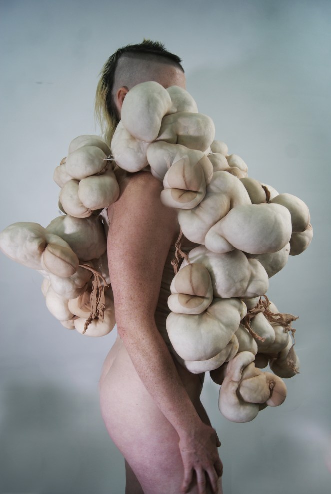
1. The following submission is titled Odious Forms. Photographed by Doyle in 2018. Modelled by Gertrude Dixon. The Odious Forms costume was built for the reclamation and repossession of abjection and humaness. Klaire is curious and angry about the way we culturally narrate body types, but the Odious Forms imagery removes documentation of a real body type, the gender of the body and wellness/ability of the body.
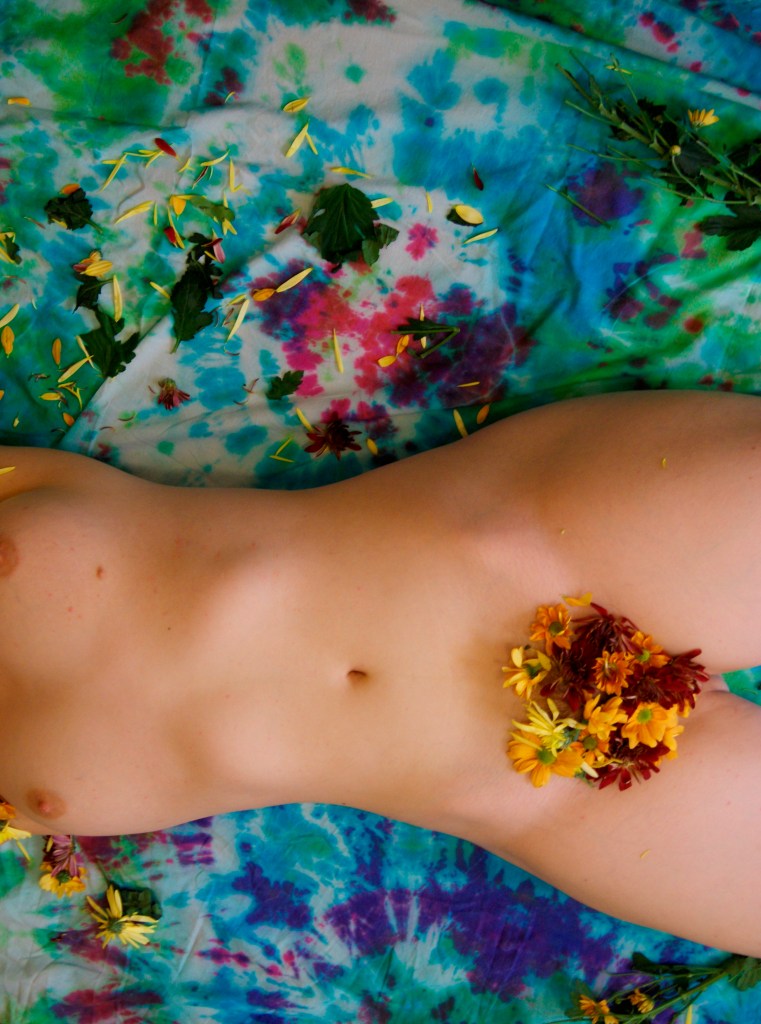
2. Klaire also submitted the below colourful and floral photograph taken of herself , by herself in 2014, titled Habitual Body Monitoring. Klaire feels that learning to love the hairs on her body in their natural state has been exhausting but she is most happy when she is both hairy and unashamedly feminine.
Next, we have a gorgeous entry from Mia Sage. Mia is 16 years olds and has loved arts and crafts for years. She enjoys painting and sketching, but loves to try new things so is hoping to start branching into digital art soon. Mia used her Gansai tambi watercolours for the majority of this piece, using her uni-ball signo silver gel pen for details. You can find Mia’s work on Instagram @x_mia.karolina_x
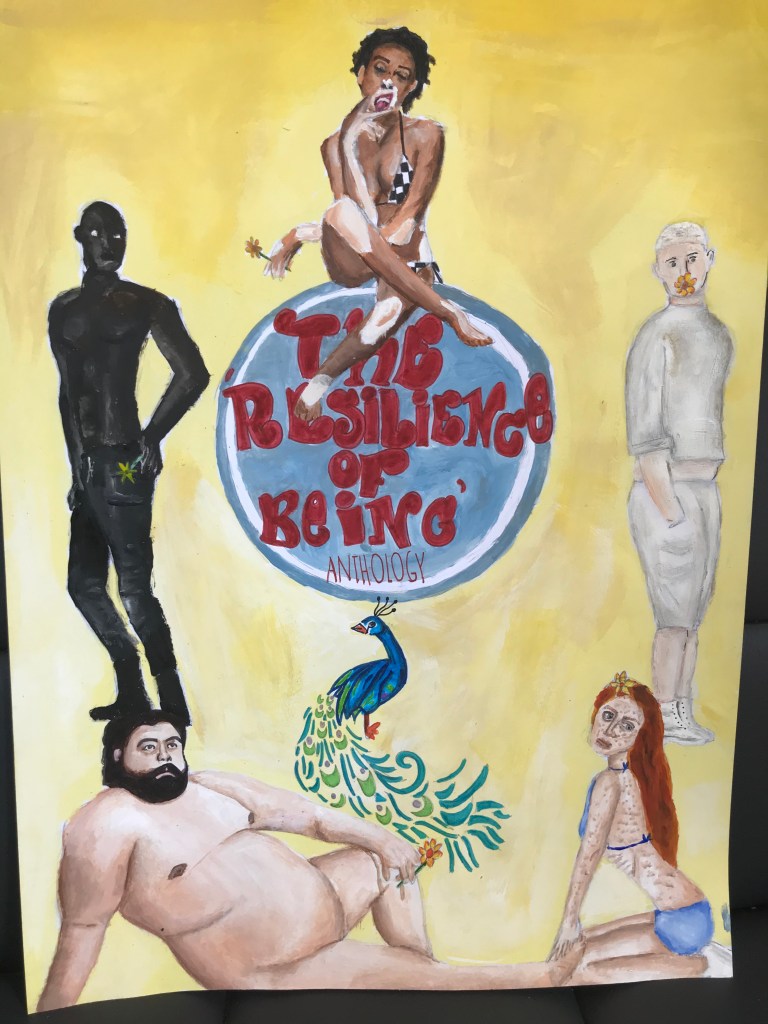
Below, we have Leah Garnett’s lovely piece. Having studied Art at GCSE, Leah was inspired by this project to create a cover that illustrated people being comfortable in their different bodies. She has also used a great deal of symbolism in her piece, with the daffodils symbolising positivity and commonality, and the peacock representing confidence.